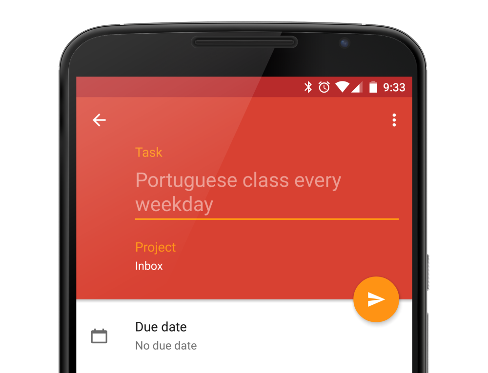
Todoist recently have their major redesign using Material Design and I thought it was actually quite nicely done! Though I found one minor design issue that might worth a mention – did you manage to figure it out at the screenshot below?
It’s the FAB icon
If you felt there is something wrong with the FAB, you are definitely not alone. The placement of the send/save icon in the FAB doesn’t seems to be centred visually (the icon weight distribution seems to be more towards to the left), but actually it was programmatically centred.
I have made a simple comparison between the current FAB and the corrected FAB below:
As you can see, even though the asset of the icon are generated correctly and placed into the FAB at the centre, it is seems to be off from the centre to the left visually when I used a centred circle as a reference. In the corrected FAB above, the icon is optically aligned, so it looks perfectly centred even though the icon in the asset isn’t perfectly aligned to the centre (it is 2dp more to the right).
Do the Optical Alignment in the Asset
So what does it mean for designer? For situation like this where the icon visual weight distribution isn’t exactly symmetrical (like the usually + or x icon), we can do some optical alignment within the 24dp so when the developer uses the asset, they will just need to programmatically centre the icon in the FAB to achieve the perfectly aligned icon. It’s worth noting that using the centred circle as a reference doesn’t always work, especially for icon that is much more complex, but it can be used as a starting point, and align/adjust it optically (using the eyes) to achieve the most balanced placement.
More on Optical Alignment
There are already a few articles on this topic by other designers, like this and this, but I thought it would be useful to mention about this in the context of Material Design, since FAB is one of the most important elements in Material Design that the user will tend to interact with it quite often, so you definitely want it to be correctly done.
Until next time!


No comments:
Post a Comment